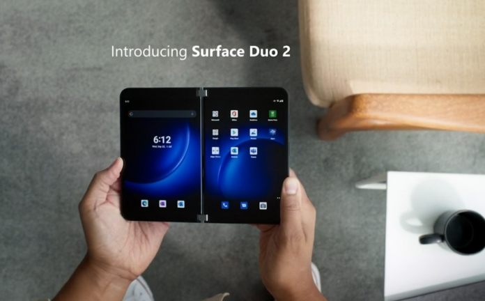
If you think back to that first Surface Duo, there was a universal opinion about the device. It was a stunning piece of hardware design and construction but there were clear compromises. The camera, big bezels, and some software quirks that did not feel ready were problems that were hard to ignore. That means the Surface Duo was probably not a smartphone for the normal user. With the new Microsoft Surface Duo 2, Microsoft is solving most, if not all, the problems. Before getting into those changes, it is worth noting that once again the Duo is running on Android and taps into Windows 11 through the Your Phone application.
Improvements
In terms of what’s different here, it is probably best to start with the design. This was one of the winning aspects of the OG Surface Duo, so Microsoft has opted for subtle changes. The design is softer and more subtle, with rounded corners and glass finishing. Unlike the grey-only option from a year ago, the Surface Duo 2 will also be available in black.
On the outside, Microsoft has put some attention to one frustrating aspect of the user experience of the Surface Duo… a lack of an outside screen. As Samsung’s Z Fold 3 and Z Flip 3 devices have outside screens, it is clear people with folding phones want some information on an outside display instead of opening their phone every time. Microsoft is not completely sold on this concept, but the Duo 2 makes some inroads. The company created the Surface Duo Glance bar which sits on the outside of the hinge. While this is not quite a notification hub, it does show you the number of calls and messages you have, alongside the time and battery life. I am not sure why this could not be a full notification ticker, and maybe it will be eventually. For now, it is a small step in the right direction… and it admittedly looks very cool. Speaking of the hinge, it has been improved this year so once again the Duo will have the best hinge mechanism in the tech world.
Camera
Onto the camera, easily one of the biggest issues with the original Duo. It simply felt like an after-through, a single primary lens that was not good enough for the Duo’s flagship credentials. Microsoft solves this with the Surface Duo 2, implementing a trip camera module featuring a wide-angle lens, an ultra-wide lens, and a telephoto camera. I doubt the Duo 2 will suddenly become the best smartphone photography experience, but this a massive improvement. On the inside, there are still bezels around the two 4-inch screens, but they have been reduced. Microsoft has also curved the screen where it meets the hinge, making it appear as the two screens are connected. Using both 90Hz screens, the Surface Duo display stretched 8.2-inches. While I will need hands on to know for sure, the signs are good that Microsoft may also solve some software issues. With Qualcomm’s Snapdragon 888 CPU, the Surface Duo 2 should run smooth and avoid the slow app transitions between screens that were a problem on the first device. As second-generation upgrades go, the Surface Duo 2 makes a lot of positive changes. Like all new Surface devices announced today, the Duo 2 will be available alongside Windows 11 on October 5. Tip of the day: By default computer names in Windows 10 tend to be quite plain. By default, they tend to be ‘WIN’ or ‘Desktop’, followed by a string of random letters and numbers. We show you how to change your PC name with Settings, Command Prompt or PowerShell to make it more easily identifiable.


